Wednesday, October 24, 2012

A Campaign you can really get behind!

In response to the flood of political lawn signs in my neighborhood, I've launched my own campaign! 
Run for office... then run for your life!!!

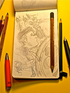
And in keeping with the theme of my blog, it started with a sketch...


After is all, it is the scariest time of year!
Vote early... and often!!!!

Sunday, September 9, 2012

Sketching with the Tombo Airpress pen.

I'm not a big ball point guy, but the Tombo Airpress at JetPens terrific. It came in handy when  personalized copies of paperbacks that I had illustrated. I would prefer to use one of my favorite fountains, but with the pulpy stock I did not want to run the risk of making a mess of the title pages.

 Beowulf, Dante's Inferno, Ten Plays of Sophocles and Ben-Hur are just a few of the covers I've designed and illustrated for Penguin, USA. To say I was red-faced to be asked to sign some copies would be an understatement, but I truly appreciated the sentiment!


The Airpress has a nice smooth line and a chunky barrel that feels good to hold. It's also pretty cool looking, you can see the inside mechanism that forces air into the ink cartridge, making it easy to write (or draw) on tricky surfaces. Comes in different colors too. Ten buck us a little pricey for a ball point in my opinion, but it makes up for it in it's cool design features and usability.


I can only hope the owner of this book likes my sketch as much as I enjoyed making it! 
Thanks to Drew at Goulet Pens for ask me to sign them!

Wednesday, May 2, 2012

"After Goya" and Higgins Eternal

Goya's Los Capricos is one of my "desert island" books with so much to see and learn from the master draughtsman and storyteller.
As an exercise in design I tried creating a version of each one of his plates in pen and ink; one per night. I've posted a few below.

I used Higgin's Eternal ink with a Speedball handle and nib that I've had for so long that I can't read it's number; but it been beautifully seasoned with years of build-up... draws like a dream. These were done in a Strathmore 9x12 sketchbook.
The original "Porque esconderlos", etching by Francisco Goya, No 30


The original "Nadie se conoce", etching by Francisco Goya, No 6


The original "Ya tienen asiento", etching by Francisco Goya, No 26


The Dover edition of Los Caprichos is a bargain for under 10 bucks; not the most sumptuous volume available, but a great investment for your library. Pair it with Goya's Disasters of War and you've got an awesome set.

Friday, March 30, 2012

Ben Hur in print

I created the cover artwork for this new edition of BEN-HUR back in August. I just received an advance copy from Penguin Books that will be on sale starting April 3rd.

It was great to do a new edition of this classic story!

I used Noodler's flex pens and #41 brown ink for the drawings; all acquired at Goulet Pens.
Goulet carries the full line of Noodler's pens and inks.

I also used a reed pen in some designs.
You can see more about the alternate illustrations and cover designs at the original posting:

Friday, March 23, 2012

Vintage Pencil Art

I ran across a link to these images on LEXIKALIKER and I just had to post them here. Gunther posted pages from an A.H. Faber catalog from 1897. Many pages are price lists but the illustrated pages contain beautiful color lithography of their products... just terrific stuff.
A.W. Faber ended the preface to this catalog with:
"...a confident hope that the universal favor so long accorded to my trade-mark will be cheerfully perpetuated."
Cheerfully indeed Mr. Faber!

Danke schoen the post Gunther!


Monday, March 5, 2012

St. Patrick's Day Parade Moleskine Sketches

The Staten Island St. Patrick's Day parade was held on Sunday and while it's a hectic day for me, I brought along something to sketch with. It's crowded and I need to be on the move so I kept the equipment to what could be carried in my pocket; my 5x8 Moleskine sketchbook and a handful of pencils.


Friday, February 24, 2012

Mural Design at the Bridgewater Commons Mall, NJ

If you've shopped at the Bridgewater Commons Mall, NJ lately, you might have seen the mural that my studio designed for General Growth Properties. The piece is eighty feet long and was unveiled last year. The structure and title is based on the Lenape Indian's ingenious method of agriculture that plants corn, beans and squash simultaneously on the same plot of land. This method was called "The Three Sisters."
Two intro panels tell the whole story behind the mural.
There's a section for every season.
GGP wanted fashionable imagery that would compliment their high-end retailers as well as something that would illustrate the history of the Bridgewater community.
These two cuties can give you a sense of the mural's scale.
It's great when shoppers stop to look.
This is one of the mall's busiest entrances.

The artwork started on my drawing board with the biggest roll of Canson paper I could find. This roll is 60" wide and is terrific stuff to draw on. I picked it up at New York Central, a very cool supply store, where the paper department is top notch and highly recommended.


We created high resolution scans of my final artwork which was then reproduced on scratch resistant vinyl that was installed at the site. With the art being reproduced to 80 feet long, I needed to work large to be sure the design would be clear.
A detail from Autumn.
Springtime means Easter, rebirth and shopping!
Detail from Winter; President Washington and valentine's Day.

Detail from Summer.  A June bride.
Detail from Spring.

The final art was done with a combination of Pentel Brush Pen, Rembrandt Soft Pastels and Prismacolor Pencils. They all worked well together on the Canson paper.
These Stad One Push pencil holders were handy for using a Prismacolor pencil right to it's very end. Find them at Jet Pens.

Just some of the Rembrandt Pastels that were passed on to me from my late uncle Tom Cutter. He kept a grand, meticulous set that was invaluable for this illustration. I am so pleased to be able to used them for a project like this! 
These Faber-Castell pastel pencils had very good reviews on Blick. I was glad that I picked them up for this project.
Detail from Spring
Summer in Bridgewater, NJ
Detail from Spring.
These are just a few of the preliminary sketches of The Three Sisters. The preparation and design for the whole job entailed weeks of research. The sketches and thumbnails could fill a post alone.

These intro panels stand at either end of The Three Sisters and describe it's design details and philosophy. If you have a chance to see the mural, I 'd love to hear what you thought!